

BACKGROUND:
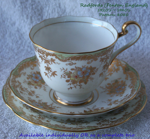
I understand you (really!) extraordinary asking price but it must be realised that genuine Beatrice Mallet Series chinaware is EXTREMELY hard to find and when you do, your pockets had better be very deep! My wife has told me that ANY Beatrice Mallet chinaware from Paragon is very rare in England and even more so in the Antipodes (Australia & New Zealand). 100 years have passed since these left the works and they were only produced for a short period of time plus being Children's themed china, many folk just tossed them out when the kids grew up! As my wife says ... "scarce as hens teeth" and she considers these as being one of her 'prizes' resulting from a trip to UK many years ago, the same trip that enabled her to score the beautiful Radfords teaset trio that she recently gave me to advertise.
I have been asked to give a bit of background to this china series from Paragon and what it represents to the collector of such things.
Yes, Paragon (originally they were known as Star China) opened their works in 1899, known as Star China Company Ltd. 20 years on, in the period 1919~1920, the name changed to Paragon China Ltd.
A 'hangover' from these early days was the star shape included in the backstamp.
But, the pedigree of Paragon isn't the thing that makes these pieces of bone china special ...
The special nature of these pieces is the illustrator who created the designs for Paragon, Beatrice Mallet.
Think of it as being analogous to the creator of Peter Rabbit, Beatrix Potter or the Bunnykins series which was originally created by Barbara Vernon (real name was Sister Mary Barbara Bailey).
Just who was Beatrice Mallet?
She was born in England, in 1896. She married a Frenchman, Hervé and they both had a passion for the art of drawing. They moved back to France and pursued careers in advertising and by per-chance, the advertising theme extended into children's products. In 1924 Beatrice created the now infamous Marinette character.
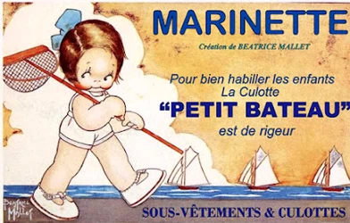
Notice how Marinette has similar illustrative characteristics to the character, Betty Boo (created by Max Fleischer some 10 years later)
Beatrice was now becoming widely recognised as a very talented illustrator and she released a number of spelling books and satirical illustrative works. It was during this time that the Paragon China Company engaged the services of the young Beatrice (she would have only been in her early 20's) to create the now infamous Beatrice Mallet Series which were a range of very highly regarded nursery chinaware's including drinking cups, bowls, teapots and others.
The characters created by Beatrice are instantly recognisable with her distinctive creative drawing style, often humorous scenes and each child character having a first name. Each scene that is depicted on these wares has a few lines of verse and of course, the signature of Beatrice Mallet - although this is a facsimile not an original!
So many words and provide so much information but both my wife and I feel that we owe it to those who are interested, to provide as much detail as possible about this very special but rather pricey chinaware and then offer the choice of either just one piece or if taking them both, a discount is applied ... they really want to leave our home together!
Chinaware (and other beautifully hand made or decorated items) is my wife's passion and websites is mine! This combination allows us to offer items which we have both loved and cared for over the years but as the "light at the end of the tunnel" is becoming brighter, (advancing age!) all of our beautiful items must find new homes to live in.
So, let's get down to the nitty gritty ...
PARAGON CHINA LTD (Was Star China Ltd Previously)- Drinking Cup & Saucer or Small Plate
Made in England
Beatrice Mallet Series Nursery wares
Circa 1920's
Material: Bone China
Translucent ... meaning that if either piece is held up to a light, you can easily see the shadow of your fingers through the china material.
Both pieces are decorated in the 'hybrid style', meaning that a combination of transferware and hand decorating has been used. The decorator's marks are on the underside of each piece. Looking extremely closely (with a loupe) at the decorations I can clearly see that ONLY the Black looks to be transferware, used as an outline for the graphics and also the text. These outlines have then been infilled with various vibrant colours, even to this day the colours are very vibrant!
Here is a description of each piece ... both pieces seem to aimed at a Boy's market, with the decorations dominated by Blues. My wife did also have another pair of these but with a leaning towards the Red-Orange coloured trimmings.
DRINKING CUP
BOB WATERING WITH THE GARDEN HOSE
Straight sides, this could also be described as a mug I guess. Base china colour is pure White and translucent.
Black paint is used for the text, graphic outlines and Beatrice's signature (a fascimile)
As the text wraps around the cup, here is the text ...
A rose-tree in Bob's garden grows
And this he waters with a hose.
Seven colours are used for the infilling of the graphic outlines, Sky Blue...Sunshine Yellow...Flesh Pink...Brown...Pink-Red...Orange-Red & Green - these coloured paints have all been applied by hand and because of this, they do not always 'stay within the Black outlines' but often leech outside of the outlines ... that's a real human at work! A soft running of your finger over the artwork will reveal that this painting is slightly raised from the transferware.
SAUCER (Or some may call this a small plate although it does have a depressed centre into which the cup sits perfectly)
TIMOTHY BEING WHEELED IN THE PRAM BY HIS SISTER, PAM
Pretty traditionally shaped saucer with an indented centre in which the cup sits. Again, the base china colour is pure White and translucent.
Just like the cup, Black paint is used for the text, graphic outlines and Beatrice's signature (a fascimile)
The text is easy to view in the photograph but here is a copy of the text ...
Timothy who's rather small Doesn't like to walk at all,
So his sturdy sister Pam Wheels him in this funny pram.
Again, just like the cup, seven colours are used for the infilling of the graphic outlines, Sky Blue...Sunshine Yellow...Flesh Pink...Brown...Pink-Red...Orange-Red & Green - these coloured paints have all been applied by hand and because of this, they do not always 'stay within the Black outlines' but often leech outside of the outlines ... that's a real human at work! A soft running of your finger over the artwork will reveal that this painting is slightly raised from the transferware.
BACKSTAMP PHOTOGRAPHS
DRINKING CUP
SAUCER
COSMETIC CONDITION:
This is the part that really matters! Just what sort of the condition are these two items in after their creation some 100 years ago?
AMAZING is the only word I can think of right now ... I am truly amazed at how well preserved both of these pieces are.
The following applies to either piece equally, any differences (such as flaws etc) are noted below this general section
CLEAN
NO cracks at all
NO chips at all
NO discolouration to the base White china
NO fading or discolouration to the colours used in the illustrations
NO crazing is evident (this REALLY amazed me, after all this time) I viewed both of these pieces dry and wet and then viewed in full sunlight, not a sign of crazing at all.
NOTE: I have had thoughts that this bone china is somehow slightly different than the 'run-o-the-mill' bone china because it looks slightly different, perhaps a little 'milky' and actually when I was first handed these by my wife I thought I was looking at Malamine! But once held in the hand and viewed in sunlight, it is easy to see it is bone china - just a bit different and perhaps that is why I could not see any crazing at all.
Practically no handling wear to the decorative work at all, I have looked carefully for scratch lines or usage wear to the rims of both items and I cannot see anything of any significance ... I keep getting surprised by these pieces! If anything, I do notice (perhaps) slight wear to the Black text on the saucer, the word his appears lighter than the text surrounding it and a couple of small 'dots' (in Black) around the text area as well. Cleaning with soap & water did not lift these - possibly they left the works like this, I cannot be sure if those dots are under the glaze or not. Please take a look at the saucer photograph to see what I mean ...
There are no further comments in relation to the cup.
The saucer does have two very small fleabites, one is near the rim edge (underneath of course) and the other is closer to the central area, underneath. Neither fleabite is discoloured. These are pretty hard to see (use of a soft rubbing with a finger was needed to find them) but I have attempted to take a photograph or two of these fleabites so you can see what I am talking about.
THIS ADVERTISEMENT IS IN THE PROCESS OF 'BEING BORN' - THE BIRTH IS EXPECTED WITHIN THE NEXT 24 HOURS (By Sunday 11th October 2026) ...
CONGRATULATIONS!
You have managed to reach the end of this rather exhaustive description of these very special pieces of Beatrice Mallet Nursery wares ... take a rest now ...